For evaluating posteriors in Bayesian analysis it is pretty common to draw a “Highest Density Interval” to indicate the zone of highest (consecutive) density within a distribution, which may be plotted in a scatter plot or a histogram or density plot or similar.
When working in ggplot, you’ll often add multiple layers to your graph in the form of “geoms”: for instance, a geom_point to show a scatterplot, which you could overlay with geom_abline to draw a trendline through the points.
But there’s no geom to draw any kind of confidence interval of a distribution on a graph. I suppose that wanting to see the density on a plot is a fairly niche thing.
I created a geom_hdi for use in ggplot. I briefly explain here how that happened; you can find the geom_hdi file on github. Using geom_hdi, you can show the distribution at any arbitrary set. It has some functionality with plotly and works with multiple groups. Keep in mind I’ve developed this for my own use, so if you want to use it, you may have to tweak to improve for your own application to ensure it works correctly!
A word of warning: the “Highest Density Interval” is similar but not the same as a “Confidence Interval”. I’d advise against using geom_hdi to plot confidence intervals on your data as it may not represent exactly the same thing.
Inspiration
I used the ggalt package’s xspline tutorial to get going. It was simple enough to copy the xspline package and go.
There were minimal changes needed here.
Creating your own ggplot geom
Let me describe how I created geom_hdi. You can follow along the steps to create your own geom.
Drawing the basic HDI
First of all, I took a look at some basic data:
library(ggplot2)
set.seed(42)
dat<-data.frame("x"=c(rnorm(1000,0,1)))

ggplot(dat, aes(x=x)) +
   geom_histogram(binwidth=0.1)
So far, so good. How would we do a 95% HDI in this data? Before we dive in and create the geom, let’s draw it manually. We can use this code later to build the geom itself. geom_segment is a good basic, flexible geom which would allow us to draw a line. We can specify x, y, xend, and yend to control the precise look of the line.
But before we draw the HDI we need to know where to put it! The hBayesDM package has a suitable HDI calculator, so we’ll use that.
dat.hdi<-hBayesDM::HDIofMCMC(dat$x)##
## This is package 'modeest' written by P. PONCET.
## For a complete list of functions, use 'library(help = "modeest")' or 'help.start()'.Cool cool. And now pass it in to our graph. I’m happy enough to put it right on the x-axis:
ggplot(dat, aes(x=x)) +
   geom_histogram(binwidth=0.1)+
  geom_segment(x=dat.hdi[1],xend=dat.hdi[2],y=0,yend=0)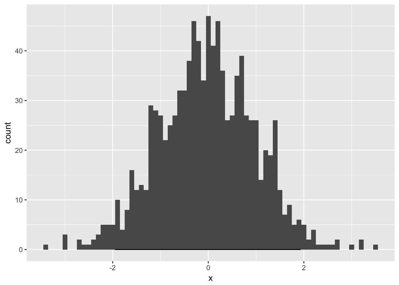
That’s a little hard to see, so we can draw it with some appropriate properties:
ggplot(dat, aes(x=x)) +
   geom_histogram(binwidth=0.1)+
  geom_segment(x=dat.hdi[1],xend=dat.hdi[2],y=0,yend=0,color="blue",size=2,lineend="round")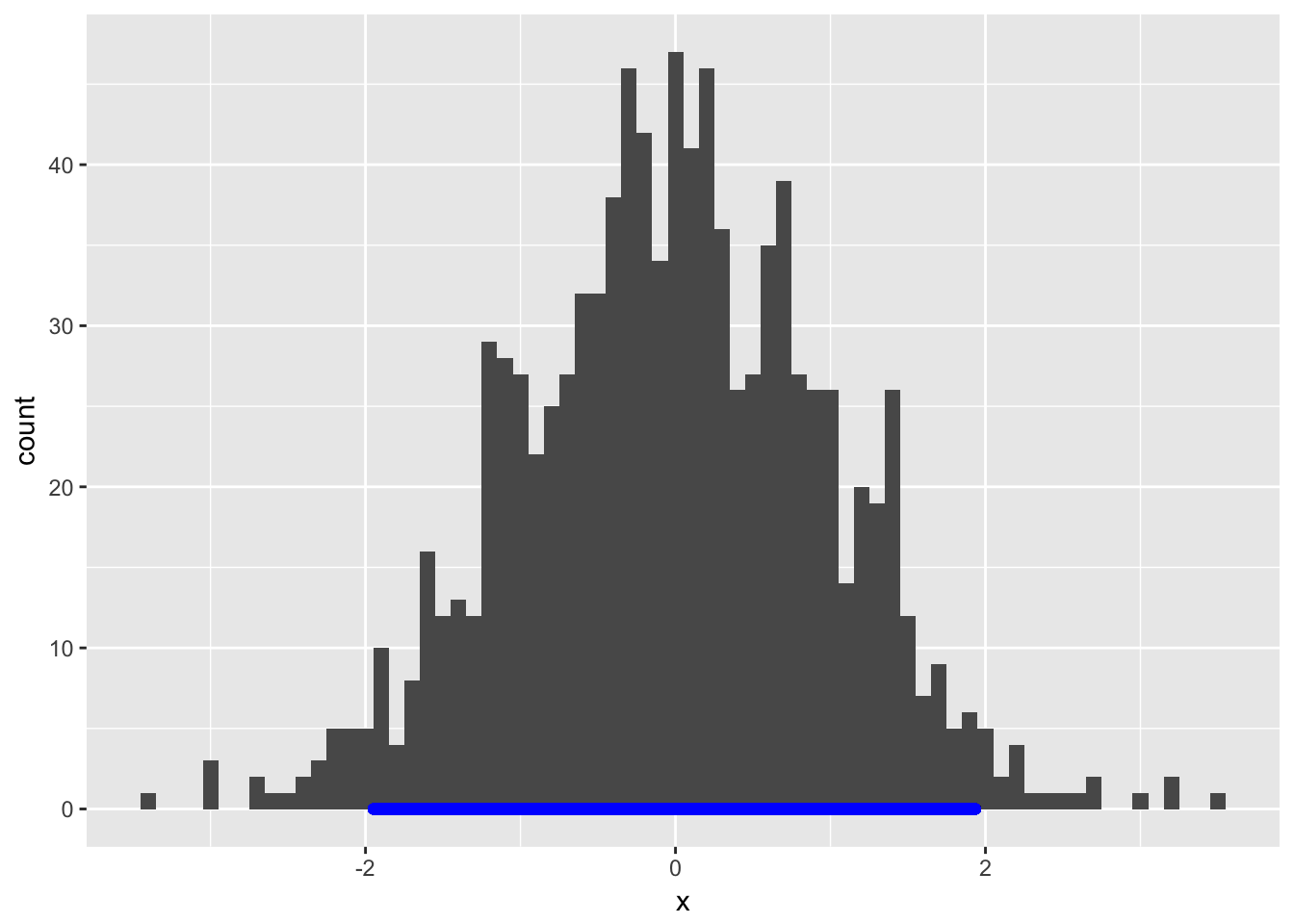
Seems good. Now, let’s say we want to do this with a whole bunch of graphs; maybe we want multiple HDIs on each graph, pertaining to different groups, and we want the properties of the line to automatically follow the properties (e.g., color) we set for different groups.
How can we encapsulate this functionality in a single geom?
Writing the geom.
Here is what I have created. This has been taken right from the excellent guide here. If you find it helpful, you can compare the geom_xspline code there with my geom_hdi to work out on your own what you’d need to modify to create your own.
There are just two functions and two wrapper calls to create the necessary ggproto objects we need to do to get the geom off the ground. One gives you the “geom” specification and the other gives you the stat specification.
geom_hdi <- function(mapping = NULL, data = NULL, stat = "hdi",
                         position = "identity", na.rm = TRUE, show.legend = NA,
                         inherit.aes = TRUE,
                     credible_mass=0.95, ...) {
  layer(
  `geom` = GeomHdi,
    mapping = mapping,
    data = data,
    stat = stat,
    position = position,
    show.legend = show.legend,
    inherit.aes = inherit.aes,
    params = list(credible_mass=credible_mass,
                  ...)
  )
}

GeomHdi <- ggproto("GeomHdi", GeomSegment,
                       required_aes = c("x"),
                       default_aes = aes(colour = "black", size = 0.5, linetype = 1, alpha = NA)
)

stat_hdi <- function(mapping = NULL, data = NULL, `geom` = "segment",
                         position = "identity", na.rm = TRUE, show.legend = NA, inherit.aes = TRUE,
                     credible_mass=0.95, ...) {
  layer(
    stat = StatHdi,
    data = data,
    mapping = mapping,
    `geom` = `geom`,
    position = position,
    show.legend = show.legend,
    inherit.aes = inherit.aes,
    params = list(credible_mass=credible_mass,
                  ...
    )
  )
}

StatHdi <- ggproto("StatHdi", Stat,

                       required_aes = c("x"),

                       compute_group = function(self, data, scales, params,
                                                credible_mass=0.95) {
                         require(hBayesDM)
                         hdi.data<-HDIofMCMC(data$x,credible_mass)
                         data.frame(x=hdi.data[1],xend=hdi.data[2],y=0,yend=0)
                       }
)
To go from geom_xspline to geom_hdi, I followed these steps:
- went through and replaced all mentions of “xspline” with the name of my
geom, hdi, taking care to do a case-sensitive replace. - then replaced all mentions of “XSpline” with “Hdi”, following convention to capitalize where appropriate. One thing that tripped me up is that for some reason, the
geomwouldn’t generate correctly when I spelled with three capital letters, “HDI”! I am not sure why this was, but it was no great sacrifice to go with the ‘camelcase’ “HDI” style. - had to replace each of the custom arguments here with my own.
geom_hdihas just one custom argument,credible_mass. If you are creating your owngeomfrom this, all you’d need to do is find whereever I mentioncredible_masshere and replace it with your own argument or set of arguments. - The easiest way to build a new
geomis to build on top of a more basicgeom. For instance, mygeomabove is built ongeom_segment; that is set in thegeomargument in thestat_hdifunction.geom_xspline, on the other hand, was built on top ofgeom_lineand passed ‘line’ into thegeomargument of the equivalentstat_xsplinefunction. When building your owngeom, pick whichever more basic element suits you and build on top of that. - Finally, I modified the
compute_groupfunction near the end to transform the arguments passed into my owngeom_hdiinto arguments that would draw an HDI using the more basicgeom_segment. I used thehBayesDM::HDIofMCMCfunction to transform x values into an HDI. By default, this is a 95% HDI, but you can set whichever values you like. At the end of thecompute_groupfunction, you want to pass a data frame that will go straight to the more basicgeomto draw.
Result
This is already better than the geom we hand-drew. It can now be used to draw in HDIs for multiple groups:
set.seed(42)
 heights.usa<-data.frame("height"=c(rnorm(10000,176,7),rnorm(10000,162,6)),
                 "people"=c(rep("Men",10000),rep("Women",10000)))

#https://biology.stackexchange.com/questions/9730/what-is-the-standard-deviation-of-adult-human-heights-for-males-and-females
#https://en.wikipedia.org/wiki/List_of_average_human_height_worldwide

height.plot<-ggplot(heights.usa, aes(x=height, group=people, fill=factor(people),color=factor(people))) +
 geom_freqpoly(binwidth=1)+
 geom_hdi(aes(color=people),lineend="round",size=2,credible_mass=0.95,alpha=0.8)+
 labs(title="US adult height distribution by gender\nCount per 10,000 adults",x="height (cm)")

height.plot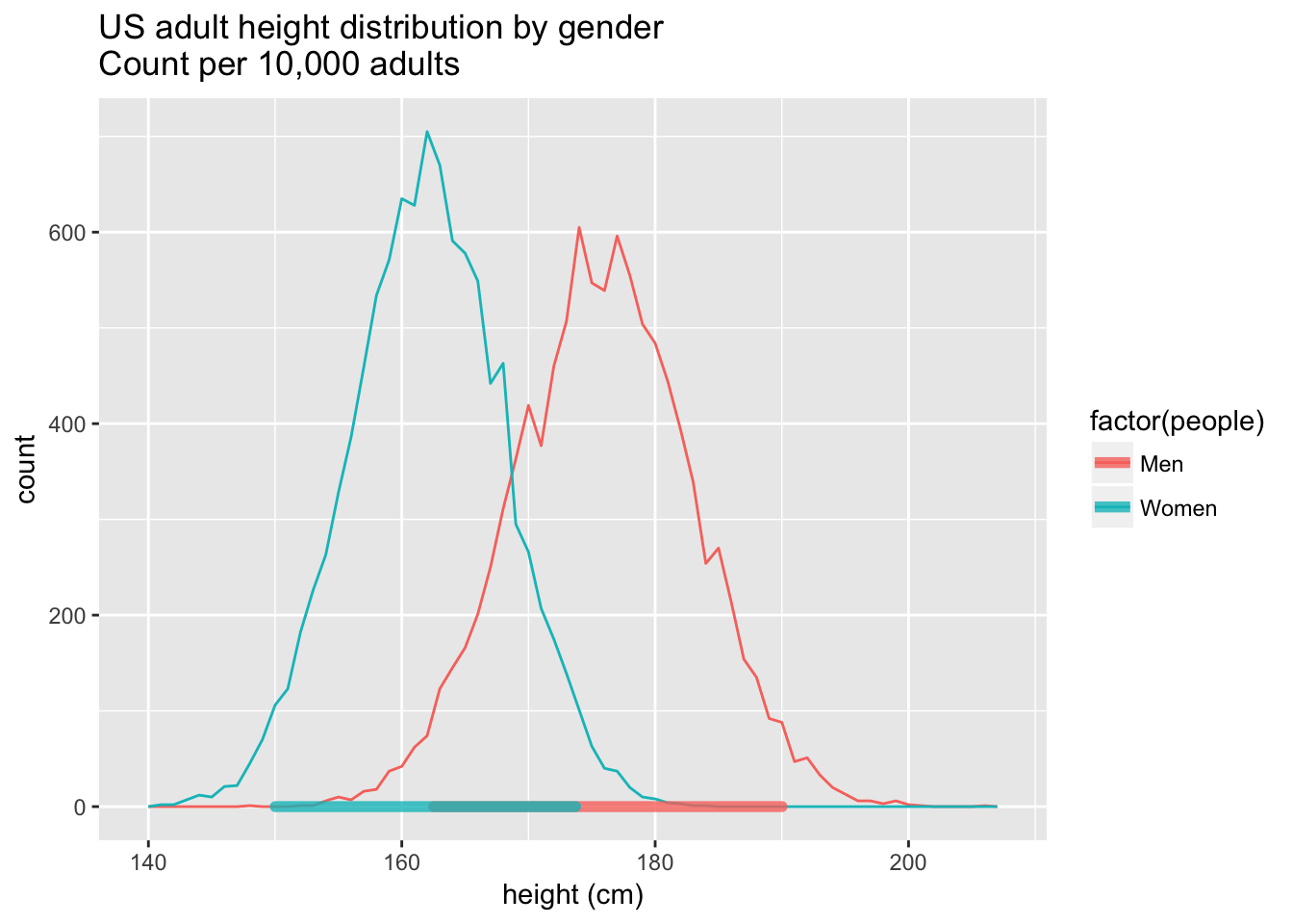
With a bit of work, we could have the function stagger these hdis if you didn’t want them lying on top of each other.
However, my priority was to get this looking nice in plotly! This required a little extra work.
Modification for plotly
The plotly documentation itself describes how to modify your custom geoms to work in polotly. Plotly graphs are pretty darn cool; take a look at this:
plotly::ggplotly(height.plot)## Warning: We recommend that you use the dev version of ggplot2 with `ggplotly()`
## Install it with: `devtools::install_github('hadley/ggplot2')`## Warning in geom2trace.default(dots[[1L]][[1L]], dots[[2L]][[1L]], dots[[3L]][[1L]]): geom_GeomHdi() has yet to be implemented in plotly.
## If you'd like to see this geom implemented,
## Please open an issue with your example code at
## https://github.com/ropensci/plotly/issues## Warning in geom2trace.default(dots[[1L]][[2L]], dots[[2L]][[1L]], dots[[3L]][[1L]]): geom_GeomHdi() has yet to be implemented in plotly.
## If you'd like to see this geom implemented,
## Please open an issue with your example code at
## https://github.com/ropensci/plotly/issuesSo you might notice here that my geom_hdi doesn’t display! That’ll take a little extra work - just one more function!
to_basic.GeomHdi<-function (data, prestats_data, layout, params, p, ...)
{
  require(tidyr)

  #x positions
  d<-tidyr::gather(data,xposinline,x,x:xend)

  #draw in appropriate y positions
  d$y<-0
  dline<-d

  structure(dline, class = unique(c("GeomPath", class(dline))))
}
You want that function name to start with to_basic. followed by the name of the ggproto object you created above, mine being GeomHdi. Everything in that function is designed to transform the GeomHDI into a format that plotly can recognize.
Unfortunately, plotly doesn’t have support for GeomSegment, so I was unable to pass the code above directly to plotly. However, plotly does support geom_path. The format for geom_path is slightly different. For this, we’d create one row in the data for each point, not each line.
A little transformation with tidyr::gather will do that trick to get the x start position and finish position into the same line. The y positions would potentially get more complicated, but in my case, because I was placing every HDI right on y=0, I could just add in one line setting every y position to 0.
Let’s try that ggplotly HDI again:
plotly::ggplotly(height.plot)Getting there! But hover over our HDIs: the printed x-coordinates are broken. Wouldn’t it be nice to show the actual HDI coordinates on that hover? Yes it would! So we can edit the data hovertext property to display that. We use the params array to find what the x axis is called (it might not always be called “x”)
to_basic.GeomHdi<-function (data, prestats_data, layout, params, p, ...)
{
  require(tidyr)
  #put a confidence interval into the hovertext
  data$hovertext<-apply(data,1,
                        function(r){
                          sub(paste0(params$hoverTextAes[["x"]],": -?\\d+(.\\d+)?(e\\d+)?"),
                              paste0(params$hoverTextAes[["x"]],": [",signif(as.numeric(r[["x"]]),4),", ",
                                     signif(as.numeric(r[["xend"]],4)),"]"),r[["hovertext"]])
                        })
  #x positions
  d<-tidyr::gather(data,xposinline,x,x:xend)

  #draw in appropriate y positions
  d$y<-0
  dline<-d

  structure(dline, class = unique(c("GeomPath", class(dline))))
}
The hovertext transform uses regex to convert the default hovertext that plotly creates for points on a line into hovertext which describes a density interval.
plotly::ggplotly(height.plot)Now our overtext displays the higest density interval.
Overview
That should give you a good start towards modifying geom_hdi for your own purposes or perhaps writing your own geom.